Bring imagination into the home with a mural
November 27, 2013
Make any surface a dry-erase space
December 11, 2013Sherwin Williams’ free app ColorSnap makes matching an existing color and finding good complementary colors…well…a snap. Whether you want to match an existing wall color, or figure out the perfect paint to go with your upholstered furniture, woodwork or artwork, or even capture the essence of a beautiful sunset, the app allows you to take a smart phone or tablet photo and the app will do the rest.
While the app is great for ideas, remember that computer screens vary, so the color you see on your phone or laptop might not be the perfect Sherwin Williams match “in real life.” But it’ll be close enough to help you start planning!
Many paint manufacturers have paint-matching apps that all work a little differently. Since we’re partial to Sherwin Williams here at Matthews Painting, here’s a link to their free app: http://www.sherwin-williams.com/homeowners/color/try-on-colors/colorsnap-for-iphone-android-and-blackberry/
Here’s how it works. I really like a color combination on a throw pillow I have and wonder if I should decorate my room around it. Here’s the pillow:

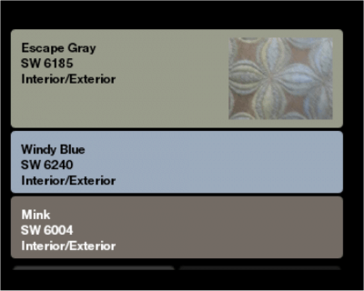
I recommend taking the photo and saving it to your phone or device rather than taking it directly through the ColorSnap app, which will not store the whole image. Then open ColorSnap and select “use saved photo.” Find the one you want and ColorSnap will show a close-up square of just part of the picture—move it around the picture until the specific colors you like are inside the square, then click “save,” and it will save that little thumbnail and instruct you to move your finger around that little square to select the color you want. When you’ve “grabbed” the color from the closeup, you can choose to ask for recommended coordinating colors or add other colors from the same picture. Here are three colors I identified from the pillow picture thumbnail below:

I can also ask ColorSnap for recommendations. Below I kept the “Escape Gray” that was identified from the pillow picture as the main color, then asked for recommended complementary colors and got this combination that I like even better:

Now, on my screen, the “escape gray” in the two palettes above don’t quite look the same as they do my phone screen, but they both match the thumbnail that they’re working with—this is why “real life” paint samples are important—“rice paddy” might still be a perfect complement to the gray in my pillow, but might not look so great to me when it’s in my real house next to my real pillow.
Let’s see what else might work still using the same pillow. Below, I went back to the original three colors I took from my picture and selected “adjust colors.” Then I was able to instead select “mink” and change it to the primary color. Then I selected “recommend secondary colors” and got the combination below:

A completely different combination that works great for my pillow! I recommend using these apps to try to identify a specific wall color or fabric you want to match, of course, but also to try to get some recommendations for working with something you’re stuck with: if you are working with natural wood furniture or trim, for example, take some pictures of the wood and the Sherwin Williams recommended coordinating colors will give you some suggestions that won’t fight with the colors you already have. Enjoy!


