
Popcorn on the ceiling, Spanish lace on the walls: Textured Wall Removal
January 16, 2014
New Year, New Room
January 30, 2014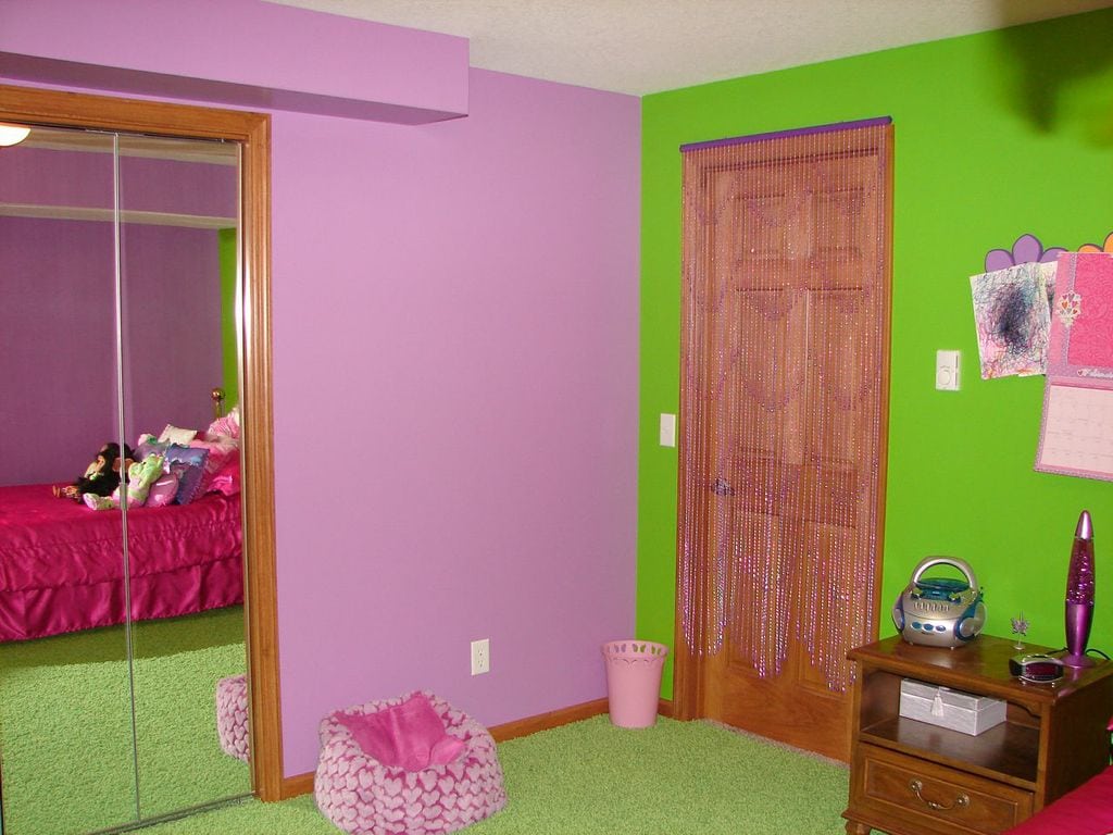
The cold, winter weather in Indiana can have us all sitting inside our homes more than the rest of the year. This extra time in the home can lead to dreams of having a totally different look surround us. That can mean anything from rearranging the furniture in a room, switching a vase or centerpiece, changing the colors of the wall in a room, or even adding a pattern to the walls. A well done pattern can change the entire feel of a room and give it a playful mood, breathing new life into the space.
Want a patterned look? There are some great ideas on the Sherwin-Williams website, including a diamond (harlequin) pattern, a polka dot pattern, and several striped looks.
Choosing a Pattern
Choosing a pattern is the first step in mixing things up in your interior space. Large, bubbly polka dots can add an air of whimsy to a space, while diamonds can add a fairytale feel, or simply be a twist on a checkered pattern to add to a rock’n’roll theme. Stripes can add any feel from a nautical twist, to the illusion that a room is taller or wider than it really is, while adding a multicolored, fun theme.
A children’s room themed with under-the-sea decorations could benefit from blue walls with light blue polka dots to look like bubbles around the room, or a bedroom could take on a rich, dimensional effect with the diamond pattern. The effect a pattern might have to liven up a room is limitless.
If keeping the same furniture and fixtures in the room, be sure to note if they will mesh well with the new theme. A rock’n’roll harlequin theme may not look right with furniture upholstered in a floral theme, just as a leather couch doesn’t look particularly appropriate with an informal, beach-y themed room.
Choosing Colors
The colors of the pattern will have a lot of influence over how the room “feels” after it is painted. The closer together the colors are in shade and saturation, the less intense the effect will be.
A bi-colored (or tri-colored) design will make a space feel “busier” and has a potential to make it feel smaller when the colors are in stark contrast (think: black and red). For help choosing colors that compliment or contrast each other, it is great to start with a color wheel. A color wheel lays out where the different hues and shades of a color line up against each other. Once you have chosen the desired juxtapositions, then it is easy to take that decision and decide on paint hues with a painting professional or from the Sherwin-Williams ColorSnap app.
It is also important to make sure that the lighting in the room can support the colors being chosen. A room with one small window and a dim lamp would benefit more from lighter colors that would reflect the light rather than darker colors that would absorb it, and vice versa.


